Oppia is an open-source, interactive online learning site that aims to create a community of everyday learners by allowing users to both teach and learn from each other.
The lesson plans in its current state were often confusing to navigate through. My job was to conduct usability tests and—from the insights gathered—redesign the existing interface to be more user-friendly.
One of the secondary goals was to bring the existing design system up-to-date so we could build a more unified design language.
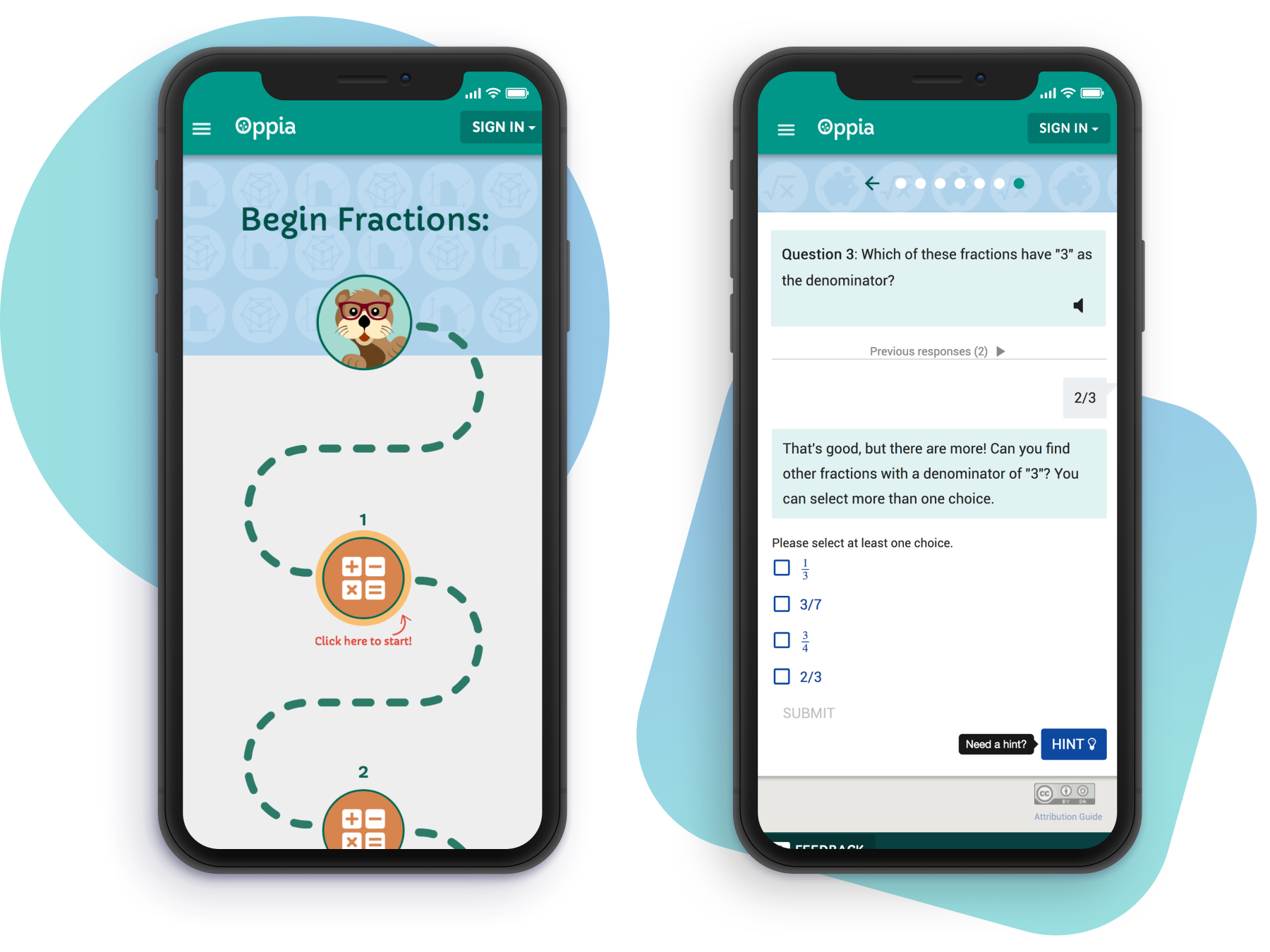
Oppia engages your student as an active participant in the learning process, providing targeted feedback to help improve where they needs it most. Among one of the ways Oppia provides that feedback is in the form of the hint feature. In its current existence, usage of the hint button is unclear to users.
How might we improve the language and functionality of the hint feature to make it more universal/intuitive to understand?
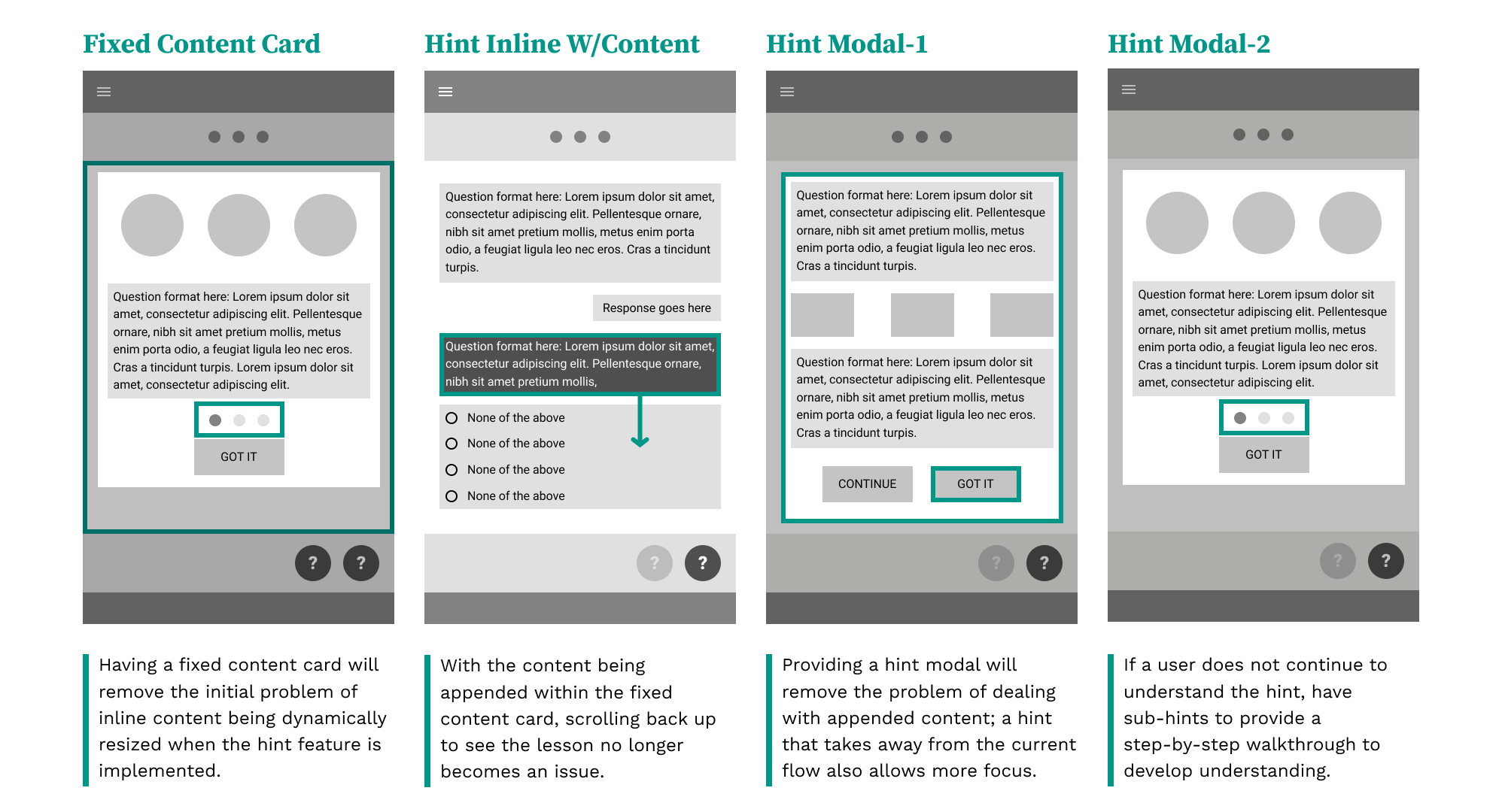
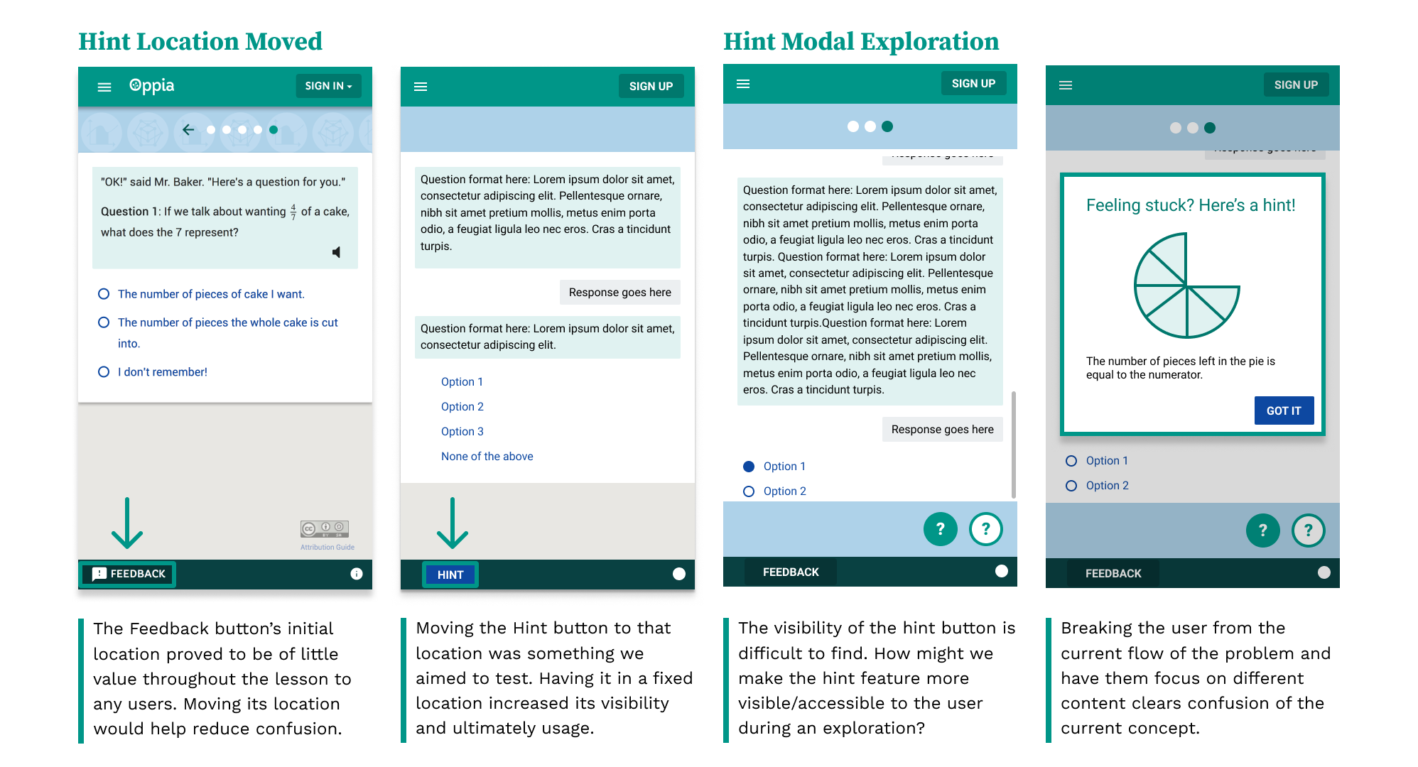
Wireframes: deviating from the current UX
Addressing the key issues of visibility and functionality
More to come
Improving the Hints feature was just one small redesign I've had a chance to work on. Among others not yet shared are improving the lesson progression experience as well as working towards an improved design system.
Case study currently in progress.
Oh, and what I really like about Oppia is it gives me the opportunity to work and learn from users all over the world. Our usability tests are conducted with students from India to Ohio and each session brings more insight into how lessons should be organized.